OPAF | Brand Identity and Marketing Collateral System
Creating brand clarity, consistency, and alignment for OPAF
Workflow
Visual Audit
Logo Refinement
Brand Guidelines Development
Collateral Design
Role
Creative Director
Brand Designer
Time
3 months
Product
Logo + Guidelines
Marketing Collateral
Workflow
Visual Audit
Logo Refinement
Brand Guidelines Development
Collateral Design
Role
Creative Director
Brand Designer
Time
3 months
Product
Logo + Guidelines
Marketing Collateral
Workflow
Visual Audit
Logo Refinement
Brand Guidelines Development
Collateral Design
Role
Creative Director
Brand Designer
Time
3 months
Product
Logo + Guidelines
Marketing Collateral
Metrics
Business
↑ Brand consistency across vendors
↑ Internal alignment with Otsuka
↑ Perceived professionalism
User
↑ Patient engagement
↑ Information clarity
↑ Trust in communication materials
Metrics
Business
↑ Brand consistency across vendors
↑ Internal alignment with Otsuka
↑ Perceived professionalism
User
↑ Patient engagement
↑ Information clarity
↑ Trust in communication materials
Metrics
Business
↑ Brand consistency across vendors
↑ Internal alignment with Otsuka
↑ Perceived professionalism
User
↑ Patient engagement
↑ Information clarity
↑ Trust in communication materials
Overview
This project showcases my approach to brand cohesion and cross-platform alignment in the healthcare space. OPAF, a philanthropic arm of Otsuka Pharmaceuticals, required assistance in unifying its brand across patient-facing brochures, internal guidelines, and vendor touchpoints. I led a visual alignment initiative, refining the logo, developing tailored brand standards, and designing a suite of clear, engaging materials for patients.

Interviews & Audit
To kick off the project, I met with key OPAF stakeholders to understand the pain points related to consistency and communication. I conducted a visual audit of existing materials and compared them to the live website and Otsuka’s master brand guidelines. This uncovered discrepancies in tone, typography, and layout that diluted the brand’s clarity and professionalism.
Original brochure and website can be seen below.
Logo Refinement
OPAF’s original logo lacked balance and the lower font was inconsistent with OPAF’s evolving brand identity. I restructured the layout, improved type hierarchy, and repositioned the icon for visual harmony. The refined logo felt more contemporary, and its alignment with Otsuka’s visual system reinforced trust and credibility.
Original logo on left, my refinement on right.


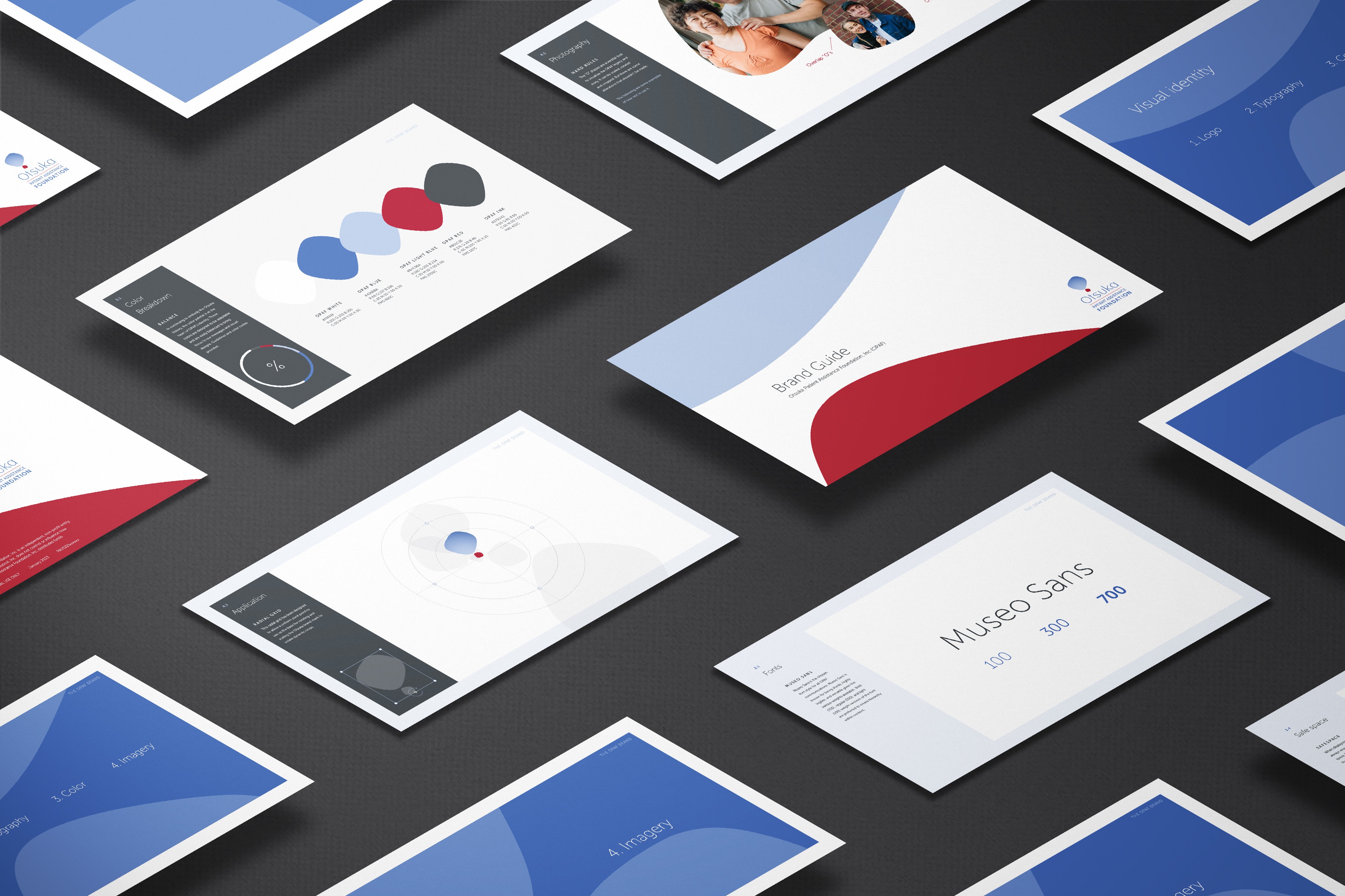
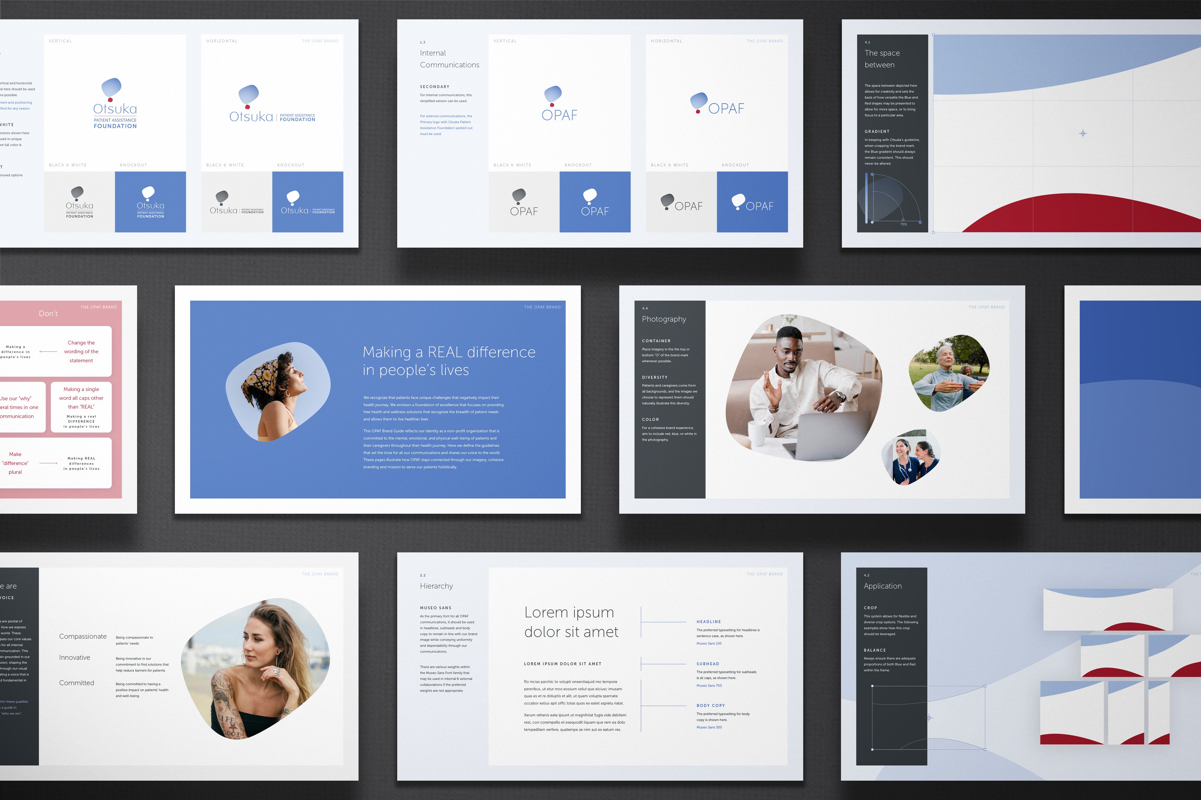
Brand Guidelines Development
To ensure long-term consistency, I developed custom brand guidelines that extended Otsuka’s standards to OPAF’s unique needs. The document included logo rules, color palettes, typography, layout systems, and voice guidance, all tailored to a nonprofit healthcare context. These guidelines empowered vendors and internal teams to produce aligned materials with minimal back-and-forth.
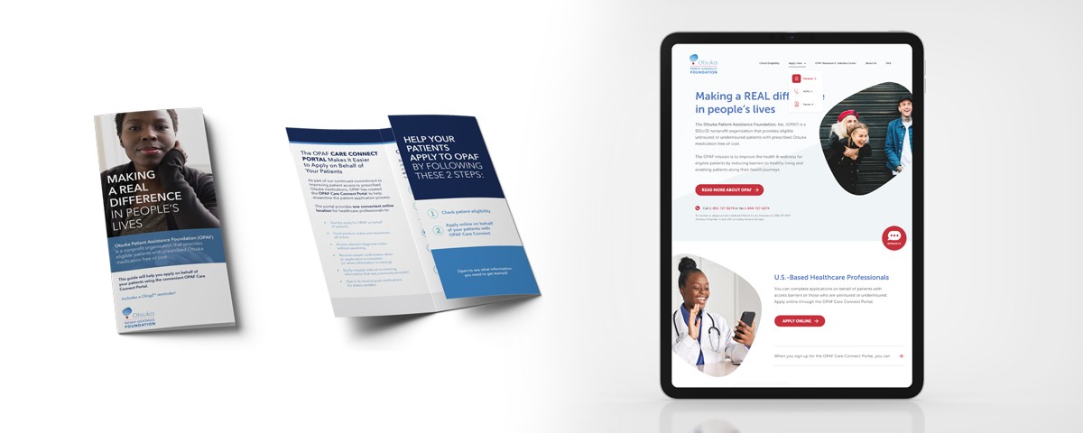
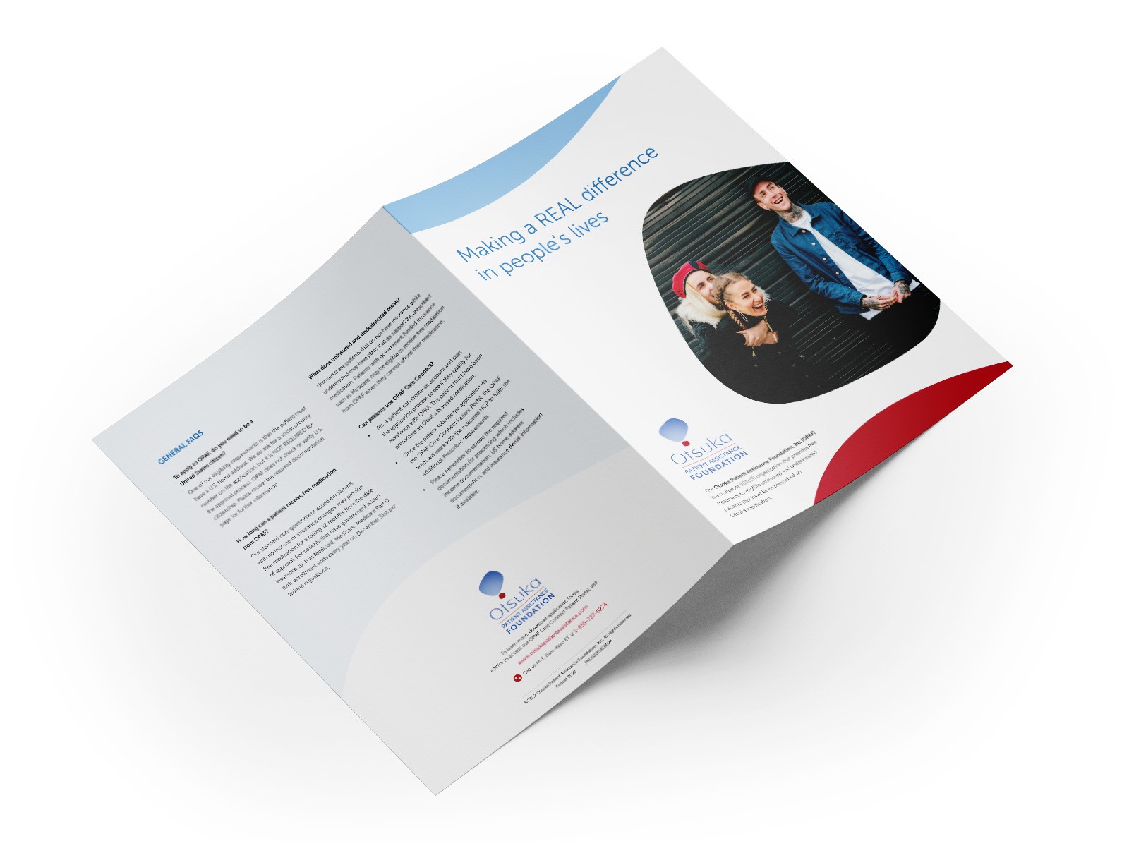
Marketing Materials
Once the guidelines were in place, it was time to redesign the old brochure series. I used insights from the audit to ensure visual and tonal consistency and tailored messaging for ease of understanding by patients and providers. Large headlines, accessible layouts, and strategically placed CTAs created a more confident, action-oriented reading experience.

Results
Shortly after implementation, OPAF reported increased inquiries and improved feedback from both patients and providers. Stakeholders praised the professionalism and clarity of the new system. The project came in 17% under budget and required zero design revisions after delivery.
Results
Shortly after implementation, OPAF reported increased inquiries and improved feedback from both patients and providers. Stakeholders praised the professionalism and clarity of the new system. The project came in 17% under budget and required zero design revisions after delivery.
Results
Shortly after implementation, OPAF reported increased inquiries and improved feedback from both patients and providers. Stakeholders praised the professionalism and clarity of the new system. The project came in 17% under budget and required zero design revisions after delivery.
“The new materials are so much clearer, our patients are actually using them.”
“The new materials are so much clearer, our patients are actually using them.”
“The new materials are so much clearer, our patients are actually using them.”
Work
Design case studies
These case studies were selected to highlight the way I approach strategy, storytelling, and user-centered design across branding, marketing, and UX.


Work
Design case studies
These case studies were selected to highlight the way I approach strategy, storytelling, and user-centered design across branding, marketing, and UX.
Work
Design case studies
These case studies were selected to highlight the way I approach strategy, storytelling, and user-centered design across branding, marketing, and UX.
Thanks!
Thanks for taking the time to check out my portfolio
Thanks!
Thanks for taking the time to check out my portfolio
Thanks!
Thanks for taking the time to check out my portfolio